






TL;DR
Shopify discount banners often fail because of weak perceived value, lack of urgency, generic messaging, poor mobile experience, and banner blindness. To improve conversions, merchants should use stronger offer framing (“Up to 50% off”), add deadlines or countdowns, create emotional and brand-specific copy, optimize banners for mobile usability, and use eye-catching visuals or personalization. When designed strategically, discount banners can increase click-through rates, boost average order value, and reduce cart abandonment.1.1 Definition
A Shopify discount banner is a promotional graphic or announcement bar displayed on an online store to highlight sales, coupon codes, or special offers. It is usually displayed on an announcement bar at the top of the homepage to grab shopper attention instantly.
As a core ecommerce discount banner format, it drives conversions, increases average order value and reduces cart abandonment from the first second a visitor lands on your site.
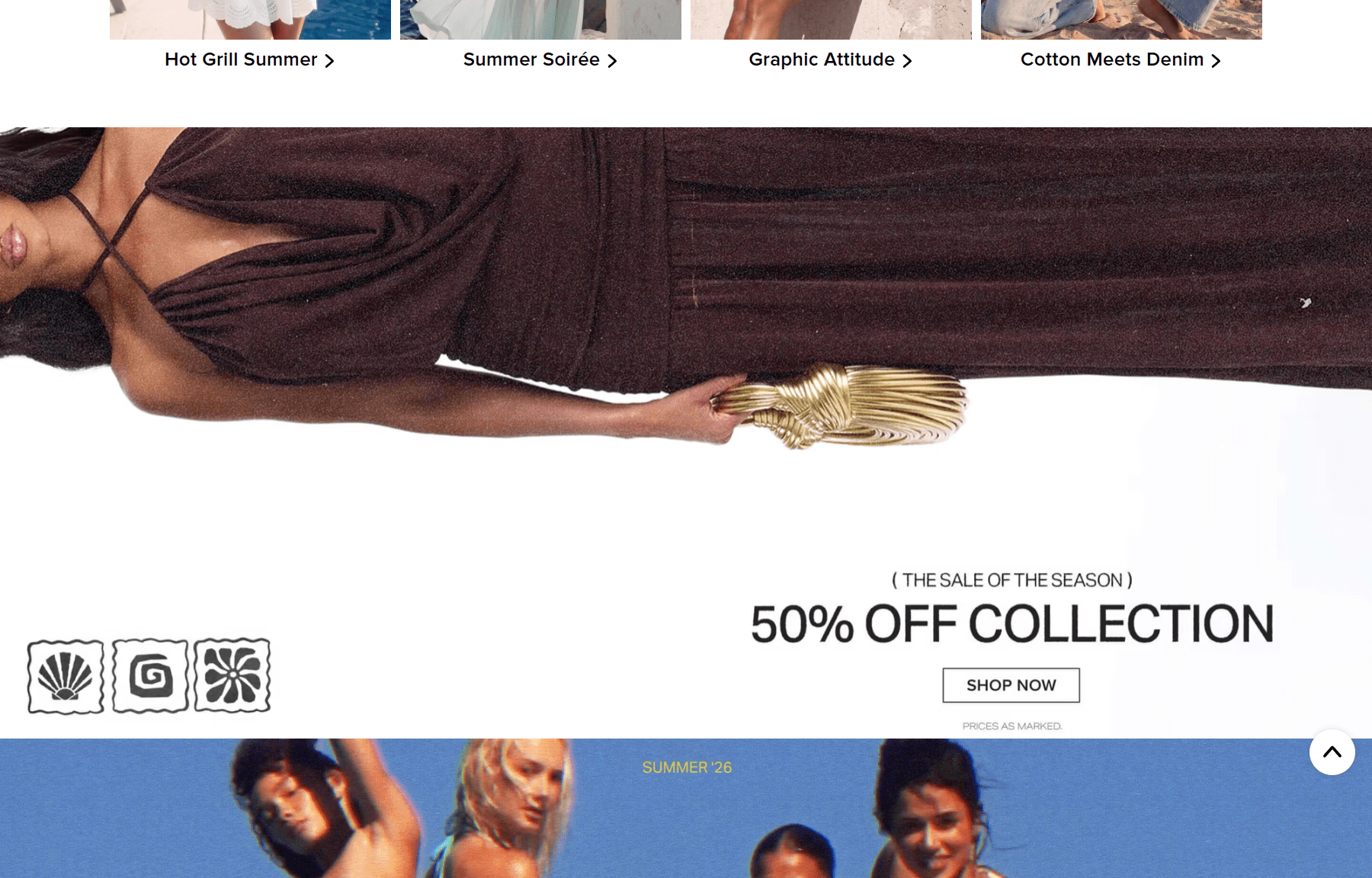
Shopify discount banner example
Besides discounts, BOGO and free gifts are also effective tools to drive AOV. Read our detailed analysis here.
Many people confuse pop-ups and sale banner. A popup appears automatically and at the corner or covers your main content, forcing attention. A Shopify promo banner sits fixed in the layout without interrupting browsing. Popups drive quick conversions but risk intrusive banner experience and user frustration. Banners offer lower interruption levels and steadier engagement effectiveness over time.
Here is a comparison table to help you understand the difference between pop up and discount banner Shopify:
- Amount off discounts banner: This type shows direct savings through a discount percentage (10% off) or a fixed amount off (-$10 off). Merchants usually use a percentage discount banner like "20% OFF" to highlight deals clearly.
- Flash sale banner: This banner promotes short-term deals with limited duration. Stores often use strong urgency messaging during holiday campaigns or weekend sales like "Sale ends tonight". It works because customers feel pressure to act before the offer disappears.
- Coupon banner: This type gives shoppers a special coupon code they must use at checkout. Some stores require customers to complete a claim process (example: click on the banner, enter email,...) before redemption.
- Free shipping discount: removes extra costs once shoppers reach a shipping threshold. Merchants often use this strategy to increase the average order value (AOV). It works because free shipping usually feels more valuable than a small discount.
A well-placed discount announcement banner Shopify store owners use is more than just a design element. It is a direct sales tool. Research shows promotions and discounts drive 54% of online purchase decisions. When used correctly, banners influence how shoppers think, feel, and decide within seconds of landing in your store.
- Impulse purchase triggers: A banner that uses strong offer framing and emotional language like "Limited time only" activates purchase motivation and creates fear of missing out (FOMO).
- Increase AOV and CRO: When customers see cost savings as perceived value, they are more likely to add more items to qualify for a deal. This directly lifts add-to-cart rate, conversion rate, and helps increase AOV on Shopify without changing your pricing structure.
To achieve these results, store owners need a clear banner placement strategy and the right messaging approach. However, many Shopify stores place discount banners randomly or rely on generic “10% OFF” offers that shoppers quickly ignore. This often leads to lower engagement, weaker click-through rate, and fewer conversions. So, what are the biggest mistakes that make a Shopify discount banner fail to convert?
- Small discounts create low emotional impact: A 10% discount banner on a $50 product saves the customer $5. That number rarely feels exciting. Studies show that discounts below 20% often fail to change purchase behavior because the savings feel too small to matter.
- Your offer looks small next to competitors: Customers see big promotions everywhere online. A 30% discount banner from a competitor will always feel more rewarding than your 10% offer, even if your base price is lower.
- Use "Up to X% off" offer framing across your range: You do not need to discount everything at the same rate. Set different discount levels across your products, then lead with the highest figure in your banner copy. "Up to 50% off" is honest, attention-grabbing, and lets you protect margins on core products while still exciting shoppers with your best deals.
- Switch to fixed-value framing: Replace "10% off" with fixed amount off copy like "Save $15 on your order today." A concrete number feels more real and more rewarding than a percentage.
- Use free shipping as a value lever: A free shipping discount with a clear shipping threshold like "Free shipping on orders over $40" often converts better than a small percentage cut because it removes a real pain point at checkout.
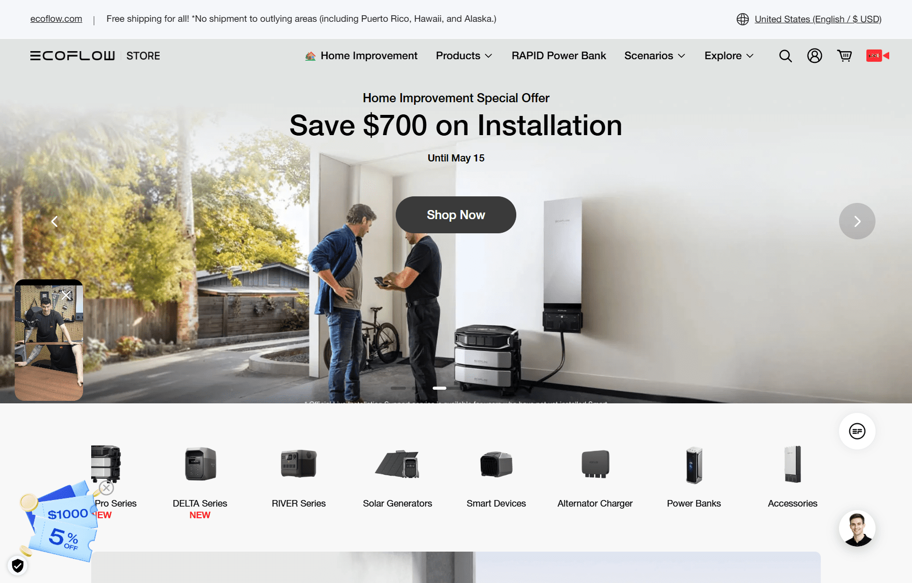
Fixed amount off discount banner on Shopify
3.2 Reason 2: No urgency
Discount alone don't motive customer to act. A deal that feels permanent creates no pressure to act. When shoppers see the same Shopify discount banner every time they visit your store, they stop treating it as an opportunity. They assume the offer will still be there tomorrow, next week, or whenever they feel ready. Without urgency, even a generous discount loses its purchase motivation power.
Common problems:
- Static banners with no deadline: A banner that never changes trains visitors to ignore it. There is no timing signal, no end date, and no reason to act now rather than later. Shoppers may bookmark the page and leave.
- Weak CTAs kill momentum: "Shop Now" with no deadline attached gives customers no emotional push. Without urgency-driven language, the banner informs but does not motivate.
- Run a flash sale banner with a visible countdown: A flash sale banner built around a specific duration, such as "Ends in 4 hours," creates real pressure. Use urgent messages like "Only today" or "Last chance" to reinforce that the window is closing fast.
- Tie banners to seasons and events: Holiday sale banners Shopify merchants run during events like Black Friday or Christmas naturally carry built-in urgency. Customers already expect deals to be time-limited during these periods, which makes your timing feel credible rather than manufactured.
- Use action-driven CTAs with a deadline: Replace "Shop Now" with phrases like "Claim your discount before midnight" or "Get the deal today only." Pairing a strong verb with a clear deadline turns a passive banner into an emotional trigger.
- Weak headlines fail to communicate value: A headline like "Big Sale On Now" tells the customer almost nothing. It does not explain what they save, what they gain, or why this offer is different from the dozen others they saw today.
- Emotionless copy weakens motivation: A banner without emotional appeal reads like a price tag, not an invitation. Customers do not just buy products. They buy outcomes, feelings, and identity. Copy that ignores this misses the most powerful conversion lever available.
But in a competitive market, your message needs to be more memorable to stand out from competitors with similar products, pricing, and discount levels.
- Lead with the outcome, not the discount: Rewrite your headline around what the customer gains. Instead of "20% off," try "Look great for less." The discount becomes proof of the promise, not the whole message. This builds trust and makes the offer feel more personal.
- Use emotional and benefit-driven framing: Strong offer framing connects the deal to a feeling. Words like "treat yourself," "you deserve this," or "while they last" add emotional appeal without sounding pushy. They make the claim feel like a reward, not a transaction.
- Match the message to your brand voice: A discount offer banner Shopify merchants design should sound like the store, not a generic ad. Personalized or brand-consistent copy builds trust and makes repeat visitors feel recognized.
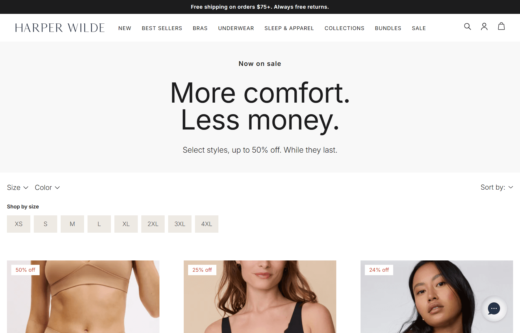
Happer Wilde discount banner
3.4 Reason 4: Poor mobile UX
Compared to desktop users, mobile shoppers have much shorter attention spans, with most people deciding within about 3 seconds whether they want to stay on a website or leave. Poor mobile banner UX wastes those seconds.
- Large banners block screens: A Shopify banner for discounts with high screen coverage on mobile pushes the main content far down the page. Shoppers who cannot see products immediately tend to bounce rather than scroll past the interruption.
- Small text is impossible to read quickly: Font readability can drop sharply on small screens. If a shopper has to zoom in to read your offer, they will not bother. The deal is lost before it is even seen, which results in a low conversion promotional banner.
- Poor mobile load speed: The banner appears after the shopper has already started scrolling, so they may not notice the deals.
- Tap targets are too small to use comfortably: A CTA button that is easy to click with a mouse becomes frustrating to tap with a thumb. Low tap accessibility leads to missed clicks and interaction delay, which breaks the buying momentum entirely.
- Use responsive design built for mobile first: Use responsive design to create a mobile optimized Shopify banner that adapts its layout, font size, and button size automatically to the screen it appears on.
- Element size: Use at least 16px for body text to avoid forced zooming. Set headlines at 24 to 30px and CTA buttons at 14 to 16px minimum.
- Optimize for speed: Compress banner images and avoid heavy scripts that slow mobile load speed.
3.5 Reason 5: Banner blindness
- Use high-contrast colors: Choose colors that stand out sharply against your site background but still respect your brand style. Bold contrast draws the eye before the brain can filter the element out, which directly helps improve banner click-through rate.
- Use a dynamic promotional banner: Motion naturally interrupts the scroll. A subtle animation, video, or an interactive element like a quiz or poll demands a moment of attention. These formats outperform static designs because they require the eye to process something new. You can also use read-time updates to keep the message feeling fresh and relevant on every visit, which resets attention retention each time.
- Personalization: Deliver Shopify discount banners targeted specifically to user interests (using AI/machine learning) like first-time visitor discounts, so it feels relevant rather than interrupting.
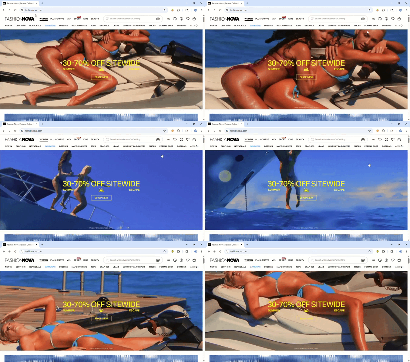
Fashion Nova discount banner
FAQs (Frequently asked questions)
1. How to place discount banners on Shopify for more sales?
One of the most effective Shopify banner placement strategies is displaying the offer above the fold so visitors see it immediately after landing on the page. You can also test scroll-depth placement for returning visitors and apply device-specific positioning to show different banner layouts on mobile and desktop. Better banner placement often leads to higher conversion rates.
2. Can ChatGPT create Shopify discount banners?
ChatGPT can help generate promotional banner copy, marketing ideas, and basic design concepts such as a “50% discount banner.” However, it cannot independently create a fully functional dynamic banner system with personalization, targeting, or live Shopify integration. For advanced promotional banners with analytics and automation, dedicated Shopify banner apps are recommended.
3. What are the best Shopify apps for discount banners?
The best Shopify discount banner apps usually provide simple setup, flexible targeting and scheduling features, customization options, and built-in analytics to measure campaign performance. Many merchants choose apps from the Shopify App Store that combine promotional banners with conversion tracking and mobile optimization.