0
(0)
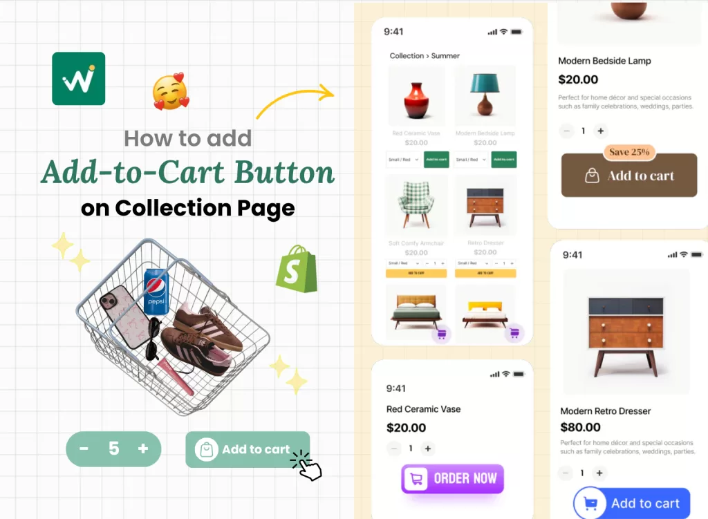
Shopify Add-to-Cart Button on Collection Page: Why it matters, common mistakes and practical tips for store customization
Here’s the reality check that might surprise you: 70% of online shoppers abandon their carts and one of the top reasons for this behavior is “too long / complicated checkout process” – checkout friction. Much of that friction starts long before they even reach checkout, it begins on your collection pages.
One of the simplest but most overlooked ways to enhance that shopping experience is by adding an Add to Cart button on your Shopify collection page. Instead of making customers click through to each product page, a strategically placed Add to Cart button allows them to shop quickly and efficiently, which can significantly boost your sales.
In this article, we’ll walk you through practical guide full of real-life tips, common mistakes to avoid to help you improve your store’s sales.
Why your Shopify Collection Page needs an Add to Cart Button?
Reduces Friction: The science behind fewer clicks
Every additional click in your customer’s journey creates what psychologists call “decision fatigue.” When shoppers have to navigate to a product page, scroll through images, read descriptions, then finally add to cart, you’re asking them to make multiple micro-decisions. Each step is an opportunity for them to get distracted, compare prices elsewhere, or simply lose interest.
The Add to Cart button on collection pages eliminates this friction by allowing instant purchasing decisions. This is particularly powerful for repeat customers who already know your products and just want to reorder quickly.
Mobile Shopping Revolution
Mobile commerce now accounts for over 70% of e-commerce traffic, and mobile shoppers have different expectations from desktop users. They want speed, simplicity, and thumb-friendly navigation. A quick add-to-cart feature caters perfectly to the mobile-first shopping behavior where users prefer scrolling and tapping over multiple page loads.
🧐 Consider this scenario: A customer is browsing your accessories collection on their phone during their lunch break. With traditional setups, they’d need to tap a product, wait for the page to load, scroll to find the Add to Cart button, then navigate back to continue shopping. With collection page buttons, they can add multiple items in seconds without losing their browsing momentum.
Impulse Purchase Psychology
Certain product categories thrive on impulse buying behavior. Fashion accessories, phone cases, small gadgets, and gift items often trigger emotional, quick-decision purchases rather than careful consideration. When customers see something they like, the moment of desire is strongest right then and there.
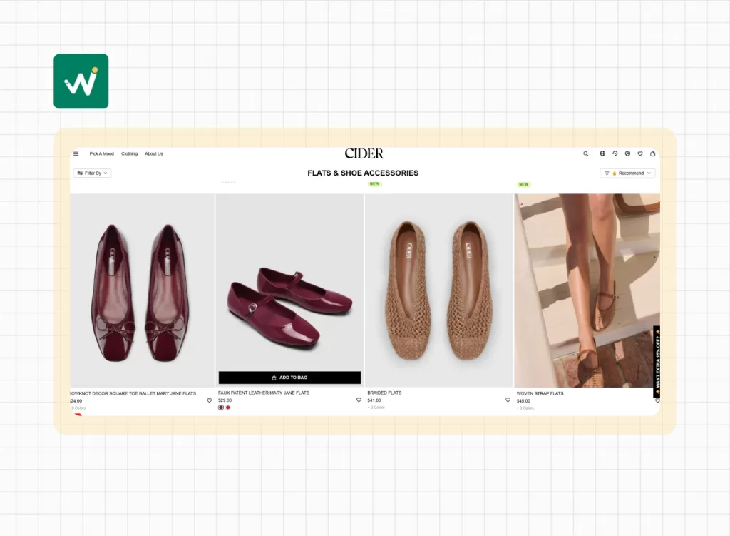
Example: CIDER adds the “Add to bag” button to encourage buyers to make the purchase right way if they like a product.
💡 The psychology is simple: impulse purchases happen in the moment. The longer the purchase process, the more time customers have to talk themselves out of buying.
Perfect for Repeat Customers and Gift Shopping
If you sell consumables, basics, or items customers reorder regularly, collection page buttons are game-changers. Think skincare products, pet supplies, or office accessories. Loyal customers don’t need to read product descriptions again, they just want to restock quickly.
Similarly, gift shoppers often buy multiple items for different people. Being able to add several products from one page makes gift shopping feel efficient rather than tedious.
Practical Tips for Adding an Add to Cart Button the Smart Way
Tip 1: Know Your Product & Customer Journey
Not every product benefits from a quick add button, and understanding your specific customer behavior is crucial before implementing this feature. The key is matching the feature to your customer’s decision-making process.
✅ Quick Add to Cart is ideal for:
- Low-consideration items: Phone cases, basic jewelry, stickers, keychains
- Repeat purchases: Skincare products, supplements, pet food
- Gift items: Candles, small home decor, greeting cards
- Fashion basics: T-shirts, socks, simple accessories
- Impulse buys: Novelty items, seasonal products, trendy accessories
🧐 Think twice about the quick add for:
- Customizable products: Items requiring size charts, color matching, or personalization
- High-consideration purchases: Electronics, expensive jewelry, furniture
- Complex products: Items needing detailed specifications or compatibility checks
- Products with many variants: Items with multiple size, color, and style combinations
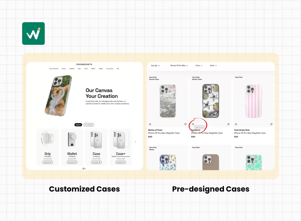
Example: Popsockets’s simple, pre-designed cases performed well with quick add buttons, but their personalized cases (requiring text input and design choices) saw better conversions when customers visited the full product page to see all customization options.
Tip 2: Start with Beginner-Friendly Shopify Apps
Apps are the most accessible way to add this functionality without touching code. However, not all apps are created equal, and choosing the right one affects both your store’s performance and your sanity.
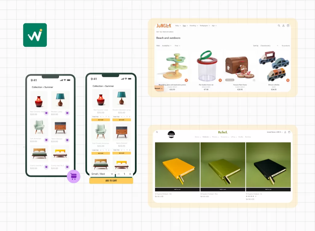
Wi Buy Now: Add to Cart Button
⭐Ratings: 5.0/5.0
💵Free to use
✨Key features:
- A wide variety of ready-made Add to Cart and Buy Now button styles for easy setup
- Attractive button designs with eye-catching cart icons and discount labels to boost clicks
- Quick Add to Cart buttons and icons that enhance cart visibility and streamline shopping
- Simple customization options to perfectly match your store’s theme
Before installing any app:
- Read recent reviews (focus on reviews from the last 3 months)
- Check theme compatibility in the app description
- Look for performance mentions – avoid apps with speed complaints
- Test with a few products first before applying store-wide
- Have a backup plan – know how to quickly disable if issues arise
Tip 3: Test Mobile & Desktop Before You Go Live
This cannot be overstated: what looks perfect on your desktop might be a disaster on mobile devices. Since mobile traffic dominates e-commerce, mobile testing isn’t optional – it’s survival.
Desktop testing checklist:
- Button placement doesn’t overlap with other elements
- Hover effects work smoothly
- Add to cart animation isn’t distracting
- Button style matches your brand aesthetics
- Loading times remain fast
Mobile testing checklist:
- Buttons are large enough for thumb navigation (minimum 44px)
- No horizontal scrolling required
- Touch targets don’t conflict with other clickable elements
- Pop-ups (if used) don’t cover essential navigation
- Add to cart process works smoothly on various screen sizes
Tip 4: Don't just add a button - Think about Store Customization
Adding functionality is only half the battle. The button needs to feel like a natural part of your store’s design, not an obvious afterthought. This is where Shopify collection page customization becomes an art form.
Design considerations:
- Button Placement: The button should be easily discoverable without dominating the product presentation. Most successful implementations place the button near the product price or below the product title.
- Visual Hierarchy: Your Add to Cart button should be noticeable but not more prominent than your product images or key product information. It should complement, not compete with, your existing design elements.
- Brand Consistency: The button style should match your overall theme. If your store has a minimalist aesthetic, a bold, flashy button will feel out of place. If your brand is energetic and colorful, a subtle button might get overlooked.
Example: A minimalist jewelry store used small, elegant “+” icons next to each product price. When clicked, the icon briefly animated to a checkmark, confirming the addition. This maintained their clean aesthetic while providing the quick add functionality.
- Color psychology: Your button color should create appropriate contrast for visibility while fitting your brand palette. Red and orange tend to create urgency, blue builds trust, green suggests “go” or positive action, and black maintains elegance.
Tip 5: Keep it light - Don't sacrifice Speed for Features
Site speed directly impacts both user experience and search engine rankings. Google considers page load speed as a ranking factor, and customers abandon sites that take longer than 3 seconds to load.
Performance best practices:
- Choose lightweight apps: Read app reviews specifically for mentions of site speed impact. Apps that add multiple scripts or large CSS files can significantly slow down your store.
- Optimize images alongside new features: If you’re adding collection page functionality, ensure your product images are properly optimized. Use WebP format when possible and implement lazy loading.
- Monitor performance metrics: Use tools like Google PageSpeed Insights or GTmetrix to benchmark your site speed before and after implementing new features.
- Regular performance audits: Set a monthly reminder to check your site speed and remove any apps or features that aren’t providing clear value.
Common Mistakes to Avoid
Skipping Mobile Testing
This bears repeating because it’s the most common and costliest mistake. Desktop-first thinking leads to mobile disasters. Always test on actual mobile devices, not just browser simulators.
Using Poorly Rated, Clunky Apps
Don’t be swayed by flashy app descriptions or low prices. Apps with poor reviews often have hidden issues like:
- Compatibility problems with popular themes
- Poor customer support
- Frequent bugs after Shopify updates
- Negative impact on site speed
Red flags in app reviews:
- Multiple mentions of site slowdown
- Complaints about customer support responsiveness
- Reports of apps breaking after Shopify updates
- Issues with app removal leaving behind code
Over-customizing without considering Theme Compatibility
Some store owners get excited about customization possibilities and try to implement every available feature. This often leads to:
- Conflicting functionalities between different apps
- Overcrowded collection pages that confuse rather than help customers
- Performance issues from too many running scripts
Not backing up your Theme before changes
Always create a theme backup before installing apps or making customizations. This simple step can save hours of frustration if something goes wrong.
Conclusion
Adding an Add to Cart button on your Shopify collection page might seem like a small detail, but it can have a big impact on your store’s sales and customer experience. By making it easier for shoppers to add products to their cart without extra clicks, you reduce friction and speed up the buying process, especially on mobile.
A smoother shopping experience is just one smart button away.
How useful was this post?
Click on a star to rate it!
Average rating 0 / 5. Vote count: 0
No votes so far! Be the first to rate this post.
Sophia Dao is a Shopify Conversion Specialist at WizzCommerce, specializing in e-commerce and Shopify solutions. With a passion for digital marketing and a keen eye for detail, Sophia creates engaging content that helps businesses thrive online. When she’s not writing, she enjoys exploring the latest trends in tech and commerce. Follow Sophia for practical e-commerce tips and the latest marketing insights!
